layout: false  ??? Key Issues - where do components get placed? - how much space should they occupy? --- name: inverse layout: true class: center, middle, inverse --- # Introduction to Layout Jennifer Mankoff CSE 340 Spring 2019 --- name: normal layout: true class: --- layout: false [//]: # (Outline Slide) .left-column[ # Today's goals ] .right-column[ - Review of tree construction - Using tree for layout - Container components - Layout Implementation in General ] --- # Review of tree construction .left-column[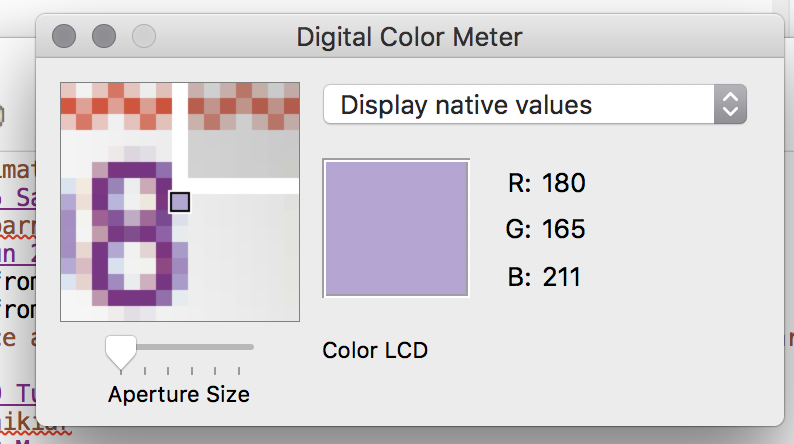] --- # Naive version .left-column[] .large.right-column[ <div class="mermaid"> graph TD W((Window)) --> M[Icon:Mag Window] W --> A[Slider:Aperture Size x y w h] W --> C[Menu:Choice x y w h] W --> I[Icon:Color x y w h] W --> T[Text:RGB x y w h] W --> La[Text:Label x y w h] classDef bluegreen fill: #d1e0e0,stroke:#333,stroke-width:2px; classDef blue fill:#e6f3ff,stroke:#333,stroke-width:2px; classDef green fill:#dbf0db,stroke:#333,stroke-width:4px; class W bluegreen class M,A,C,I,T,La blue </div> ] --- .left-column[ # Why do we need layout? ] .right-column[ How can you center something? How can you lock it to an edge? How can you design layout that reacts well to turning your phone? ] --- .left-column[ ## Layout Assignment - Part 1 is about basic reactive layout using the GUI/XML ] .right-column[ |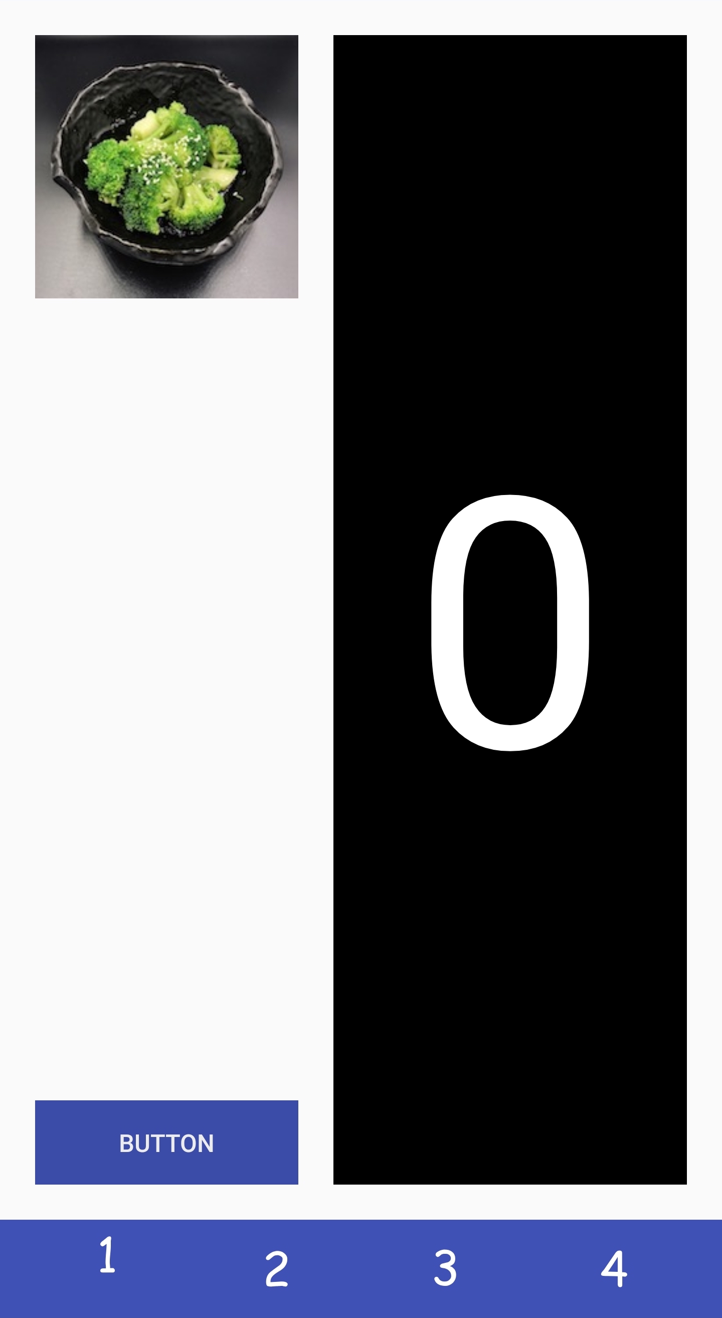|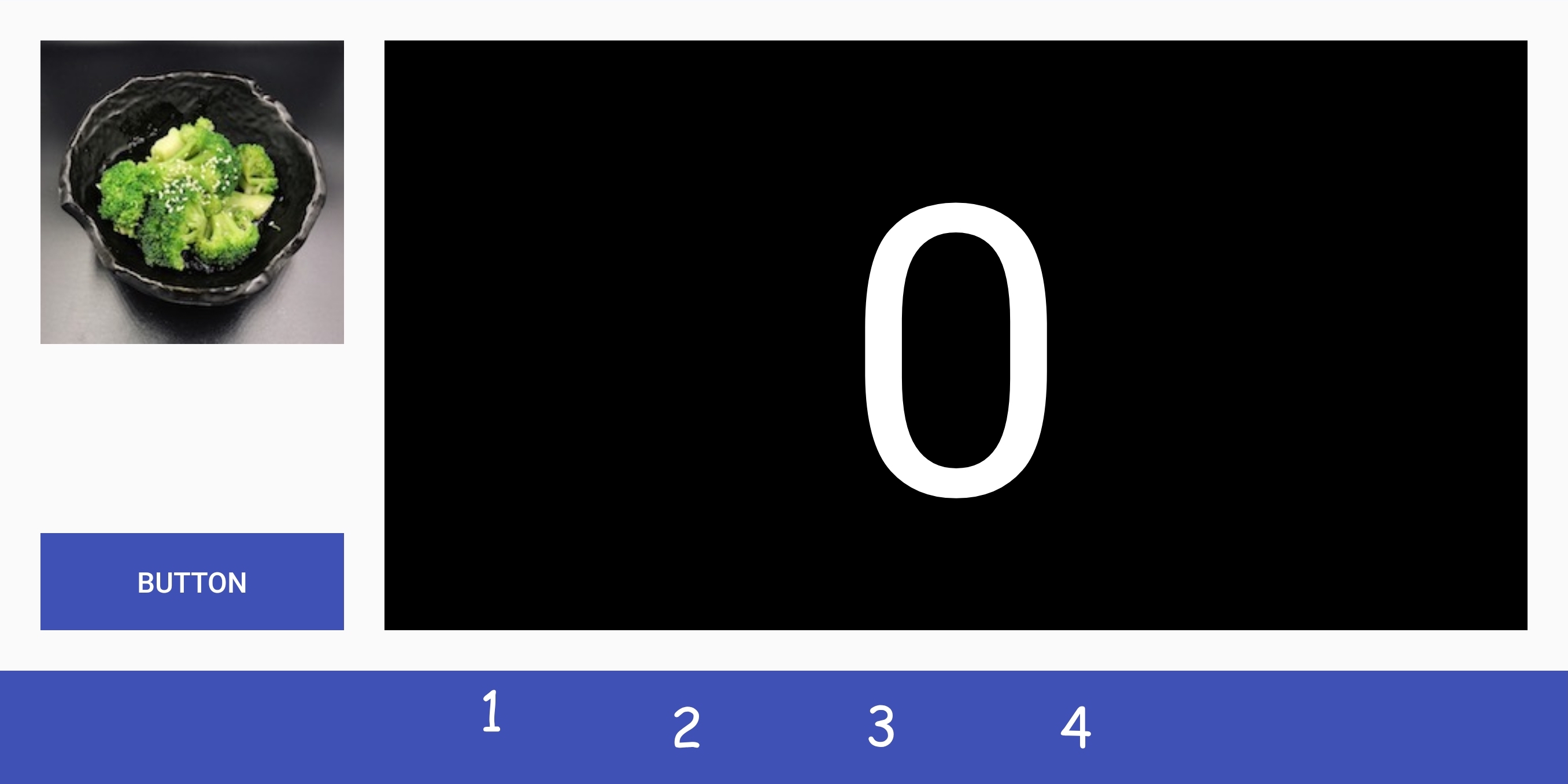| |---|---| ] --- .left-column[ ## Layout Assignment - Part 1 is about basic reactive layout using the GUI/XML - Part 2 adds scrolling using XML ] .right-column[ |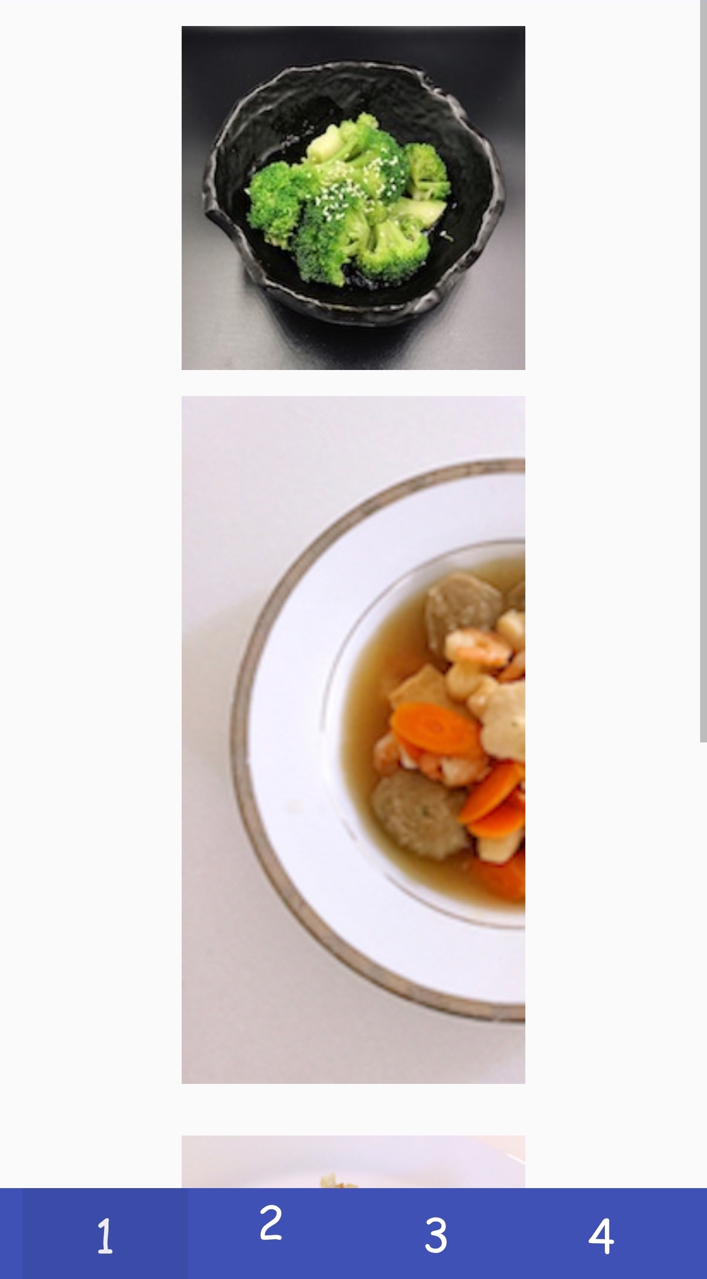|| |---|---| ] --- .left-column[ ## Layout Assignment - Part 1 is about basic reactive layout using the GUI/XML - Part 2 adds scrolling using XML - Part 3 reproduces Part 2 in code ] .right-column[ |||| |---|---|--| ] --- .left-column[ ## Layout Assignment - Part 1 is about basic reactive layout using the GUI/XML - Part 2 adds scrolling using XML - Part 3 reproduces Part 2 in code - Part 4 implements your own Pinterest layout container in code ] .right-column[ ||| |---|---| ] --- .left-column[ ## Strategies for Layout ```xml <?xml version="1.0" encoding="utf-8"?> ... <TextView ... <LinearLayout ... <Button android:id="@+id/button" android:layout_width="wrap_content" android:layout_height="wrap_content" android:text="@string/Save" /> ... </LinearLayout> ``` ] .right-column[ 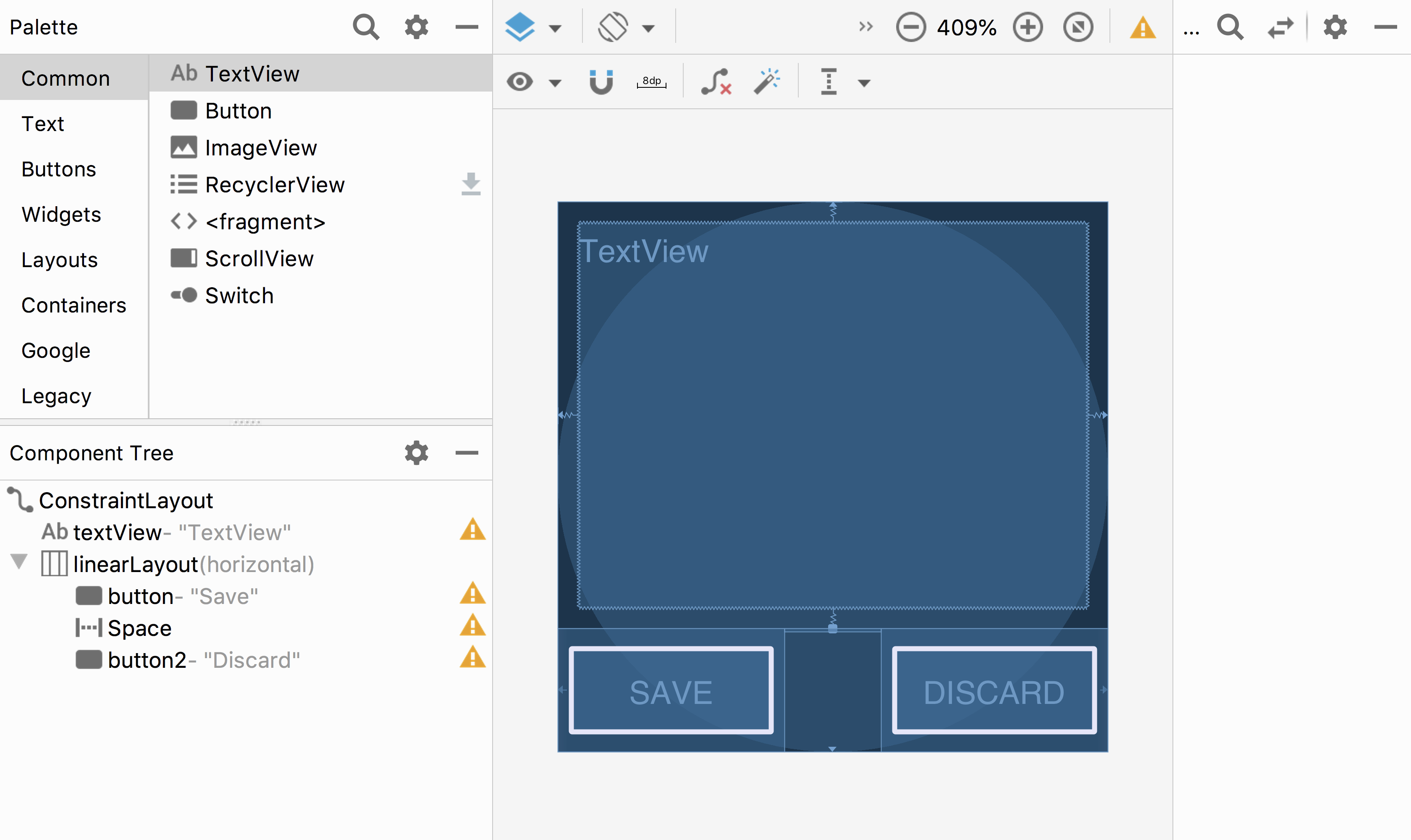 ] ??? NOTE: This is model view controller... Demonstration: PRINT THIS LIST - Show dragging things to create layout - Show different size and orientation phones - Show editing attributes - Show clicking on things in box to change type - Show simple interface hierarchy - Show simplifying xml - Show changing button names/ids What examples do we have here? - Layout container (linearlayout) - Spacer - springiness - struts - constraints --- .title[Two ways to declare Interactors] .body[ Declare elements in WYSIWYG editor, which will automatically create and initialize the objects Instantiate UI classes at runtime. For example: ```java import android.view.ViewGroup.LayoutParams; Button okButton = new Button(this); okButton.setText("OK"); LinearLayout layout = (LinearLayout)findViewById(R.id.linearLayout); LayoutParams lp = new LayoutParams(LayoutParams.MATCH_PARENT, LayoutParams.WRAP_CONTENT); layout.addView(okButton,lp); ``` ] ??? fix both to wrap_content add this if time ```java // you can change the ID ... in XML or in code for (int i = 0; i<layout.getChildCount(); i++){ view = layout.getChildAt(i); view.setBackgroundColor(Color.RED); } ``` --- .left-column[ ## Three important layout concepts in our example  ] .right-column[ 1. Layout containers `LinearLayout layout = (LinearLayout)findViewById(R.id.linearLayout);` - automate a lot of the layout tasks - make it much simpler to ensure reliable results - use these whenever they do the job - you will implement one for your assignment! ] --- .left-column[ ## Three important layout concepts in our example 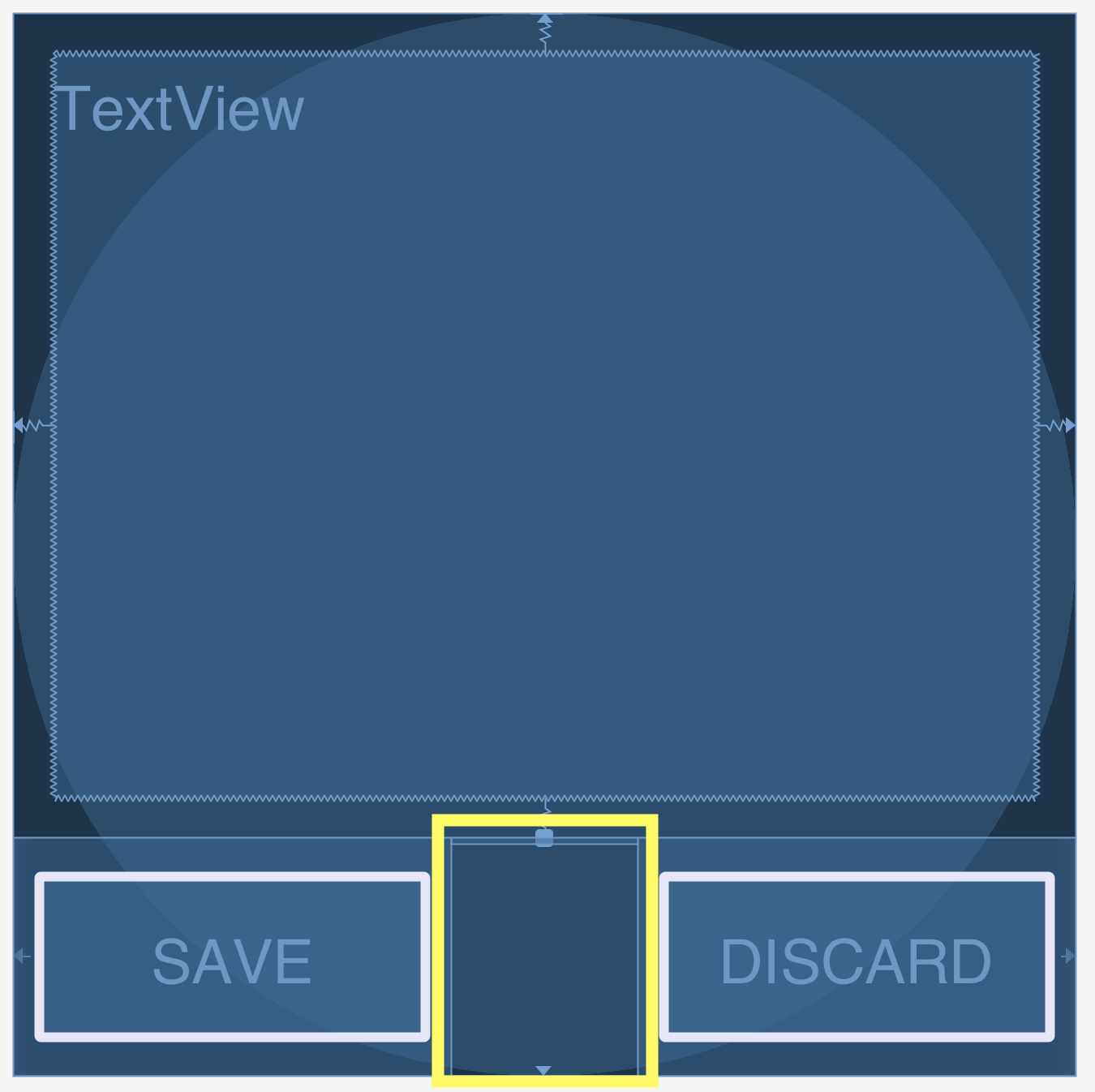 ] .right-column[ 1. Layout containers 2. Spacers ```xml <Space android:layout_width="0dp" android:layout_height="wrap_content" android:layout_weight="1" /> ``` - can be solid ('Strut') - or stretchy ('Spring') - really important when paired with layout containers ] --- # Let's try to recreate this layout using containers and spacers .left-column[] -- .right-column[ <div class="mermaid"> graph TD W((Window)) --> L(LeftSide:DisplayVert) W --> R(RightSide:SettingsVert) L --> Z[Space:Fixed] L --> M[Icon:Mag Window] L --> A[Slider:Aperture Size] L --> Y[Space:Stretchy] L --> C[Menu:Choice] R --> D(RGB DisplayHor) D --> V[Space:Fixed] D --> I[Icon:Color] D --> T[Text:RGB] D --> U[Space:Flexible] R --> Q[Text:Label] classDef bluegreen fill: #d1e0e0,stroke:#333,stroke-width:2px; classDef blue fill:#e6f3ff,stroke:#333,stroke-width:2px; classDef green fill:#dbf0db,stroke:#333,stroke-width:4px; classDef yellow fill:#ffffe6,stroke:#333,stroke-width:4px; classDef darkblue fill:#7887AB,stroke:#333,stroke-width:6px; class W bluegreen class L,R,D green class Z,Y,V,U yellow class M,A,C,I,T,Q blue </div> ] --- # Vertical Container Components .left-column[] .right-column[ <div class="mermaid"> graph TD W((Window)) --> L(LeftSide:DisplayVert) W --> R(RightSide:SettingsVert) L --> Z[Space:Fixed] L --> M[Icon:Mag Window] L --> A[Slider:Aperture Size] L --> Y[Space:Stretchy] L --> C[Menu:Choice] R --> D(RGB DisplayHor) D --> V[Space:Fixed] D --> I[Icon:Color] D --> T[Text:RGB] D --> U[Space:Flexible] R --> Q[Text:Label] classDef bluegreen fill: #d1e0e0,stroke:#333,stroke-width:2px; classDef blue fill:#e6f3ff,stroke:#333,stroke-width:2px; classDef green fill:#dbf0db,stroke:#333,stroke-width:4px; classDef yellow fill:#ffffe6,stroke:#333,stroke-width:4px; classDef darkblue fill:#7887AB,stroke:#333,stroke-width:6px; class L,R darkblue class W bluegreen class D green class Z,Y,V,U yellow class M,A,C,I,T,Q blue </div> ] --- # Horizontal Container Components .left-column[] .right-column[ <div class="mermaid"> graph TD W((Window)) --> L(LeftSide:DisplayVert) W --> R(RightSide:SettingsVert) L --> Z[Space:Fixed] L --> M[Icon:Mag Window] L --> A[Slider:Aperture Size] L --> Y[Space:Stretchy] L --> C[Menu:Choice] R --> D(RGB DisplayHor) D --> V[Space:Fixed] D --> I[Icon:Color] D --> T[Text:RGB] D --> U[Space:Flexible] R --> Q[Text:Label] classDef bluegreen fill: #d1e0e0,stroke:#333,stroke-width:2px; classDef blue fill:#e6f3ff,stroke:#333,stroke-width:2px; classDef green fill:#dbf0db,stroke:#333,stroke-width:4px; classDef yellow fill:#ffffe6,stroke:#333,stroke-width:4px; classDef darkblue fill:#7887AB,stroke:#333,stroke-width:6px; class D darkblue class W bluegreen class L,R,D green class Z,Y,V,U yellow class M,A,C,I,T,Q blue </div> ] --- # Spacers .left-column[] .right-column[ <div class="mermaid"> graph TD W((Window)) --> L(LeftSide:DisplayVert) W --> R(RightSide:SettingsVert) L --> Z[Space:Fixed] L --> M[Icon:Mag Window] L --> A[Slider:Aperture Size] L --> Y[Space:Stretchy] L --> C[Menu:Choice] R --> D(RGB DisplayHor) D --> V[Space:Fixed] D --> I[Icon:Color] D --> T[Text:RGB] D --> U[Space:Flexible] R --> Q[Text:Label] classDef bluegreen fill: #d1e0e0,stroke:#333,stroke-width:2px; classDef blue fill:#e6f3ff,stroke:#333,stroke-width:2px; classDef green fill:#dbf0db,stroke:#333,stroke-width:4px; classDef yellow fill:#ffffe6,stroke:#333,stroke-width:4px; classDef darkblue fill:#7887AB,stroke:#333,stroke-width:6px; class Y,Z,V,U darkblue class W bluegreen class L,R,D green class Z,Y,V,U yellow class M,A,C,I,T,Q blue </div> ] --- .left-column[ ## Three important layout concepts in our example  ] .right-column[ 1. Layout containers 2. Spacers 3. Constraints - Very general - Can reproduce most other things - Can operate on multiple axes - Can enhance other layout options ] --- .left-column[ ## Three important layout concepts in our example 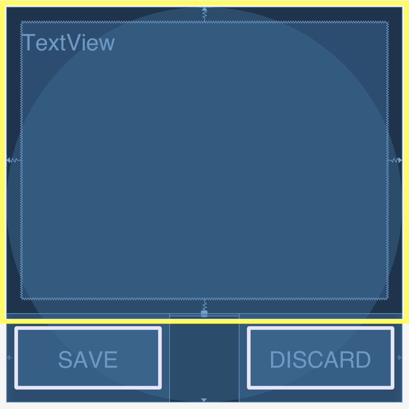] .right-column[ 1. Layout containers 2. Spacers 3. Constraints ```java <TextView android:id="@+id/textView" android:layout_width="0dp" android:layout_height="0dp" android:layout_marginStart="8dp" android:layout_marginTop="8dp" android:layout_marginEnd="8dp" android:layout_marginBottom="8dp" android:text="@string/sample_text" app:layout_constraintBottom_toTopOf="@+id/linearLayout" app:layout_constraintEnd_toEndOf="parent" app:layout_constraintStart_toStartOf="parent" app:layout_constraintTop_toTopOf="parent" /> lp.setMargins((int)(1*density),0,0,0); ``` ] --- .left-column[ ## Constraints in Android 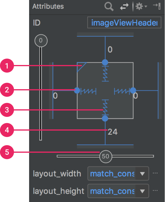] .right-column[ [Docs](https://developer.android.com/training/constraint-layout/): limited set of constraints - 1 Size ratio - 2 Delete constraint (not a constraint, just removes them) - 3 Height/width mode (3 main types): - Wrap constraint  - Fixed size  - Match Constraint  - 4 Margins - 5 Constraint bias (essentially weights on competing constraints) Range of attachment options (e.g. button sides, corners) Worth getting to know additional abstractions (groups; guidelines; barriers; chains) ] ??? -bias lets us create something that is 2-3 of the way over rather than centered go back to android to demo again --- .left-column[ # Powerful option ] .right-column[ Declare relationships (.red[what] should be true) System automatically maintains relationships under change (.red[how]) ] --- .left-column[ # Powerful option ] .right-column[ Declare relationships (what should be true) - This should be centered in that - This should be 12 pixels to the right of that - Parent should be 5 pixels larger than child System automatically maintains relationships under change (how) ] -- .right-column[ Too good to be true? - Unsolvable for arbitrary things - Works really well for a limited set ] ??? a good set for ui programming xx need to make sure I know why it is hard for arbitrary things --- .left-column[ # Note that these are one-way constraints ] .right-column[ You can change the right side, and it will update the left side (not the reverse) Can be very inefficient -- O(2^n) But highly efficient incremental update algorithms exist ] ??? Only have to update things that might change Hudson's work on this was seminal can have a DAG but not a cycle (thus, a tree) hard to guard against cycles --- layout: false [//]: # (Outline Slide) .left-column[ # Today's goals ] .right-column[ - Review of tree construction - Using tree for layout - Container components - __Layout Implementation in General__ ] --- .left-column[ # How is position calculated by the toolkit architecture? ] .right-column[ Toolkit architecture invokes layout Containers do the work (why Doodle worked: FrameLayout doesn't) - Manage size and position of children - Enforce component abstraction - Simple loop through child components --> Recursive tree traversal - Translate child to correct location - Clip child after drawing is complete Know how to handle resizing (reactive) ] ??? - Parent knows how to setup for drawing of children, invoke their drawing code, and add additional output (before and/or after) based on what the parent is and its internal state - Whorfian effects (things not in the library are hard) - Nesting not well defined --- .left-column[ # How do Container Components actually do layout? ] .right-column[ Key Issues: Where do components get placed? How much space should they occupy? How to react to changes - number of components - size of window ] ??? Who should get to decide kids' size? parents or kids? - top down vs bottom up approach --- .left-column[ # What do container components need to do this? ] .right-column[ Ideally: - child's preferred size - child's minimum size - child's maximum size And they get to ignore all of that, but usually try not to. ] --- # Simplest possible layout implementation (similar to what is in Frame layout) Depth first tree traversal No consideration of child size or position in doing layout Simplified from FrameLayout [source code](https://android.googlesource.com/platform/frameworks/base/+/master/core/java/android/widget/FrameLayout.java), [View](https://android.googlesource.com/platform/frameworks/base/+/master/core/java/android/view/View.java) and [ViewGroup](https://android.googlesource.com/platform/frameworks/base/+/master/core/java/android/view/ViewGroup.java) ```java protected void onLayout(boolean changed, int l, int t, int r, int b) { foreach child c { if (child.isVisible()) {n Rectangle r = child.getLayoutParams(); childLeft = padding + r.x; childTop = padding + r.y; child.layout(childLeft, childTop, r.w, r.h); } } } ``` ??? we're ignoring the implementation of gravity here --- # Generalized explanation of layout Simplified, basic structure for any Android layout, including your own custom one! Details of most else, and two-pass process, handled in [View](https://android.googlesource.com/platform/frameworks/base/+/master/core/java/android/view/View.java) and [ViewGroup](https://android.googlesource.com/platform/frameworks/base/+/master/core/java/android/view/ViewGroup.java) ```java // Two pass traversal of component hierarchy // First: Measure everything protected void onMeasure(int widthspec, int heightspec) { // loop through children in order they were added foreach child { // get child's layout params // apply appropriate rules to them } // based on all that, update our dimensions setMeasuredDimension(this) } ``` --- # Generalized explanation of layout Simplified, basic structure for any Android layout, including your own custom one! ```java // Second: do the actual updating public void onLayout(Rectangle newBounds) { // loop through the kids (this is depth first) foreach child { if (child.isVisible()) { // get the saved parameters Rectangle l = child.getLayoutParams(); child.layout(l.mLeft, l.mTop, l.mRight, l.mBottom); } } } ``` --- .left-column[ # How is this done in Android? ] .right-column[ Handled with a set of abstractions associated with a container component [javadocs for constraint package](https://developer.android.com/reference/android/support/constraint/package-summary) - Specified in the GUI (Chapter 18 & 19 of optional android book) - Can also be specified or viewed in XML (Chapter 21 of optional android book) ] --- .left-column[ # Review ] .right-column[ The importance of the Component Hierarchy in just about everything - Draw and redraw - Layout A More Flexible Model of Interactor Size - Natural size (preferred size) - Min size - Max size Models for doing layout ] --- .left-column[ # General & Powerful Approach: Constraints ] .right-column[ General mechanism for establishing and maintaining relationships between things - Layout is one use - Several other uses in UI - Connection of application to UI, e.g. deriving appearance from data - Multiple views of same data - Automated semantic feedback - Automatic arrangement of lines (powerpoint snapping!) ] --- # code written in lecture (MainActivity.java) ```java super.onCreate(savedInstanceState); setContentView(R.layout.activity_main); Button okButton = new Button(this); okButton.setText("OK"); LinearLayout layout = (LinearLayout) findViewById(R.id.linearLayout); LayoutParams lp = new LayoutParams(LayoutParams.WRAP_CONTENT, LayoutParams.WRAP_CONTENT); layout.addView(okButton,lp); for (int i=0; i<layout.getChildCount(); i++) { View view = layout.getChildAt(i); view.setBackgroundColor(Color.RED); } ``` --- .title[XML used in lecture] .body[ ```xml <?xml version="1.0" encoding="utf-8"?> <android.support.constraint.ConstraintLayout xmlns:android="http://schemas.android.com/apk/res/android" xmlns:app="http://schemas.android.com/apk/res-auto" xmlns:tools="http://schemas.android.com/tools" android:layout_width="match_parent" android:layout_height="match_parent" tools:context=".MainActivity"> <TextView android:id="@+id/textView" android:layout_width="match_parent" android:layout_height="0dp" android:text="TextView" app:layout_constraintBottom_toTopOf="@+id/linearLayout" app:layout_constraintEnd_toEndOf="parent" app:layout_constraintStart_toStartOf="parent" app:layout_constraintTop_toTopOf="parent" /> <LinearLayout android:id="@+id/linearLayout" android:layout_width="0dp" android:layout_height="wrap_content" android:layout_marginBottom="8dp" android:orientation="horizontal" app:layout_constraintBottom_toBottomOf="parent" tools:layout_editor_absoluteX="8dp"> <Button android:id="@+id/button2" android:layout_width="wrap_content" android:layout_height="wrap_content" android:text="Hello" /> <Space android:layout_width="wrap_content" android:layout_height="wrap_content" android:layout_weight="1" /> <Button android:id="@+id/button" android:layout_width="wrap_content" android:layout_height="wrap_content" android:text="Button" tools:layout_editor_absoluteX="0dp" tools:layout_editor_absoluteY="478dp" /> </LinearLayout> </android.support.constraint.ConstraintLayout> ``` ] --- # End of deck --- #Conceptual form of UI constraints ``` java // this is 5 pixels to the right of that this.x = that.x + that.w + 5 // this is centered this.x = that.x + that.w/2 - this.w/2 // this is 10 larger than children this.w = 10 + max_child().x + max_child().w ``` --- # What went wrong? .left-column50[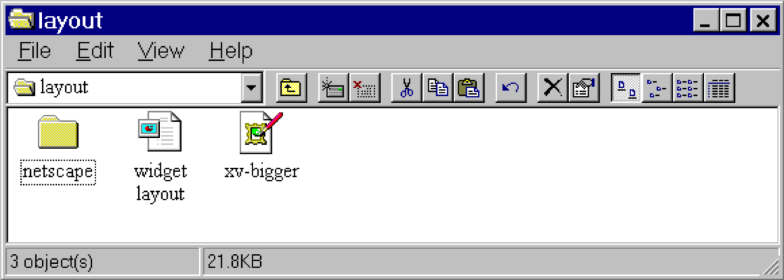] .right-column50[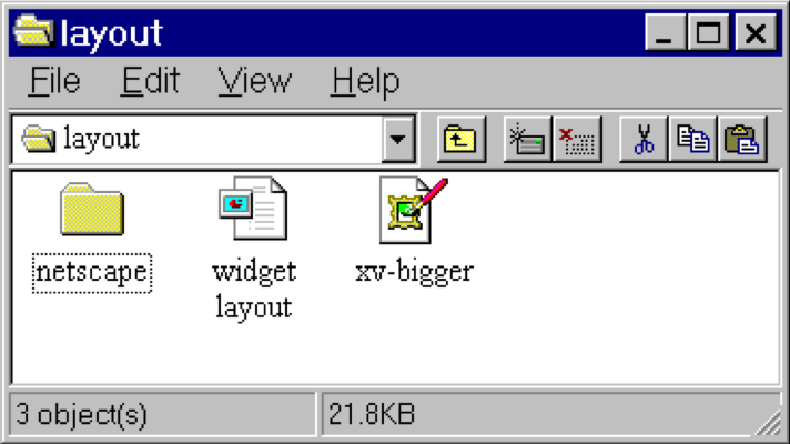] ??? - Changing available space e.g., window resized by user - Changing sizes, fonts, etc. - Adding and removing components - Layout mechanism has to deal with all cases --- # What went wrong? 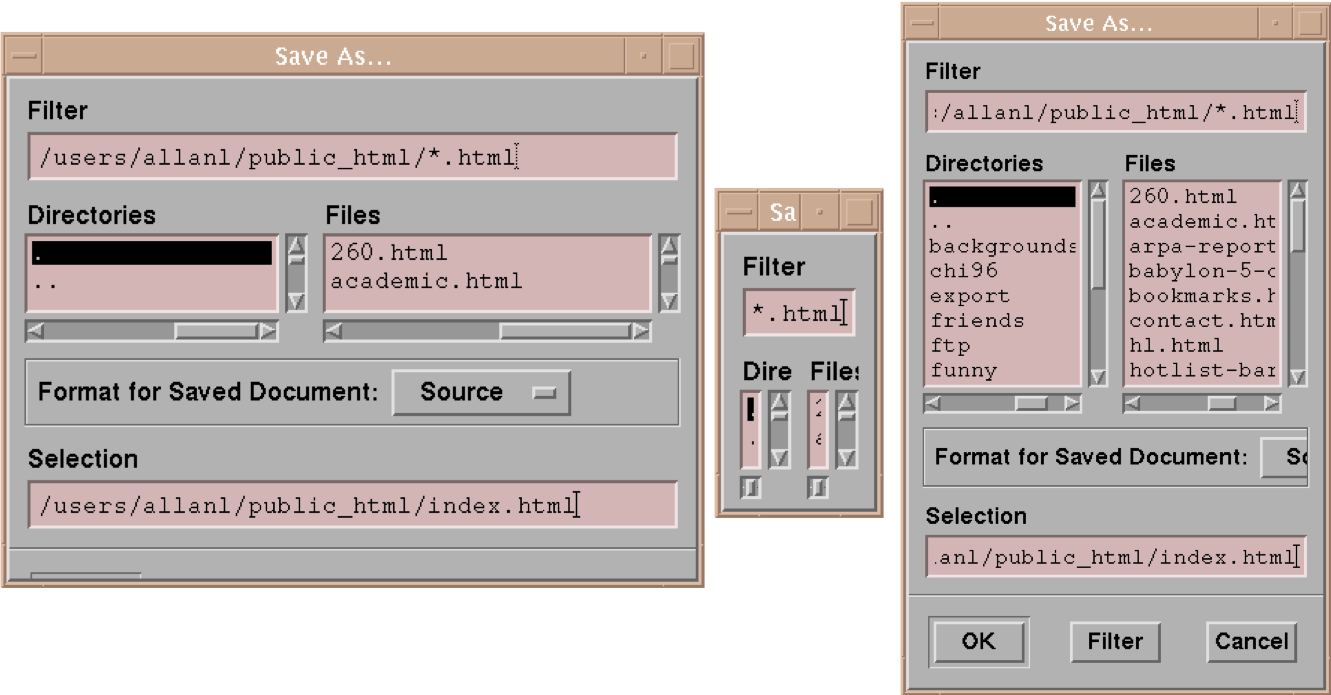 ??? - No scroll bar for text boxes that are too narrow - No way to redistribute space between directory & file list - Important controls (e.g., Open) get hidden - Min size is much too small - No way to send the dialog away (buttons gone) --- .left-column[ ## Example: Linear Layout of Email [Linear Layout Tutorial](https://developer.android.com/guide/topics/ui/layout/linear) 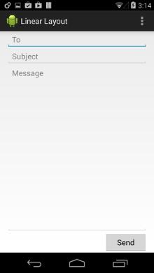] .right-column[ ```xml <LinearLayout xmlns:android="http://schemas.android.com/apk/res/android" android:layout_width="match_parent" android:layout_height="match_parent" android:paddingLeft="16dp" android:paddingRight="16dp" android:orientation="vertical" > <EditText android:layout_width="match_parent" android:layout_height="wrap_content" android:hint="@string/to" /> <EditText android:layout_width="match_parent" android:layout_height="wrap_content" android:hint="@string/subject" /> <EditText android:layout_width="match_parent" android:layout_height="0dp" android:layout_weight="1" android:gravity="top" android:hint="@string/message" /> <Button android:layout_width="100dp" android:layout_height="wrap_content" android:layout_gravity="right" android:text="@string/send" /> </LinearLayout> ``` ] ??? Can implement all of the things we discussed earlier using constraints note that they can be hard to debug? Discussion of specific inheritance hierarchy for constraints - Only have to write once when we use classes properly - can mix and match things --- # Frame layout -- actual implementation (slightly simplified) Simplified from FrameLayout [source code](https://android.googlesource.com/platform/frameworks/base/+/master/core/java/android/widget/FrameLayout.java), [View](https://android.googlesource.com/platform/frameworks/base/+/master/core/java/android/view/View.java) and [ViewGroup](https://android.googlesource.com/platform/frameworks/base/+/master/core/java/android/view/ViewGroup.java) ```java // this is implemented in view public void layout(int l, int t, int r, int b) { // first make sure everything has a size (recursively) onMeasure() // then do layout onLayout(changed, left, top, right, bottom) } // a layout class should override onLayout. In FrameLayout protected void onLayout(boolean changed, int l, int t, int r, int b) { // recursively calls layout on each child foreach child { LayoutParams lp = child.getLayoutParams(); int width = child.getMeasuredWidth(); int height = child.getMeasuredHeight(); int childLeft = parentLeft + lp.leftMargin; // add padding int childTop = parentTop + lp.topMargin; // add padding child.layout(childLeft, childTop, childLeft + width, childTop + height); } } ``` ??? Traverses the hierarchy many times over as implemented Can try to be more efficient or give more control... tradeoffs --- # Frame layout -- actual implementation (slightly simplified) ```java protected void onMeasure(int widthMeasureSpec, int heightMeasureSpec { // recursively calculate size of children foreach child { // ... calculate max child width and max child height maxWidth = Math.max(maxWidth, child.getMeasuredWidth() // + margins); maxHeight = ... } // ... add in padding setMeasuredDimension(... based on what was found) // now recursively set dimensions for all children foreach child { final View child = getChildAt(i); child.measure(childWidthMeasureSpec, childHeightMeasureSpec); } } ``` ??? there's a bunch of other code to do with gravity I'm not covering --- # Try it yourself 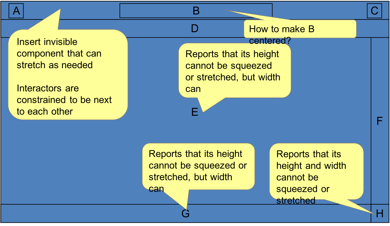]
layout: true